CASE STUDY
Salon booking & brand experience
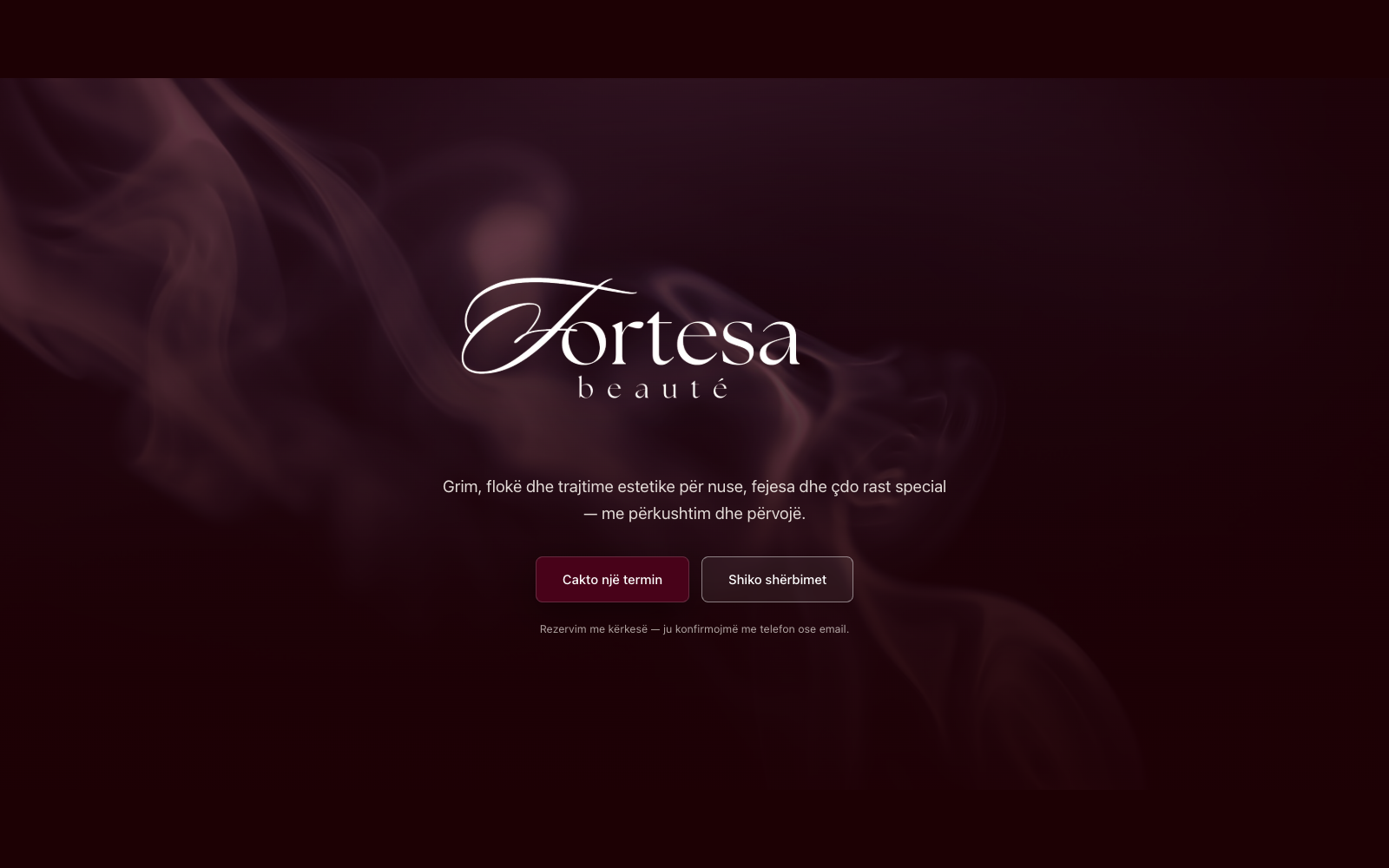
A beauty salon's whole online presence, built end to end: a cinematic landing page with its own color science and photography treatment, a live-availability booking flow clients actually enjoy using, and a secure back office running the business quietly underneath — revenue splits, reconciliation, deposits — that a visitor never sees but the salon relies on every day.
- Platform
- Web
- Shipped
- 2026
From first sketch to opening day.
We ran the build through okton's eight stages — the same arc behind every project.
- 01
Think
A high-end salon needed to feel like a well-run atelier online, not a generic booking widget — calm, refined and trustworthy from the first scroll.
- 02
Frame
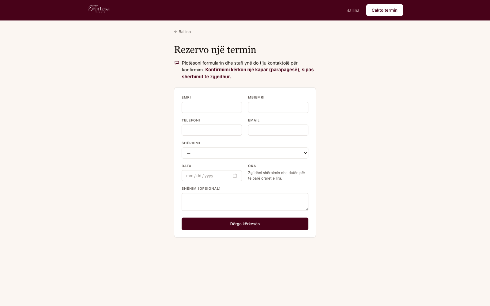
One site, two surfaces sharing a single domain: a public booking flow that only ever requests an appointment, and a private back office that runs the whole business behind it.
- 03
Spec
We wrote down the pricing and revenue-split rules before a line of UI: every service carries its own price and its own owner/employee split, and a booking locks in both the moment it's made.
- 04
Design
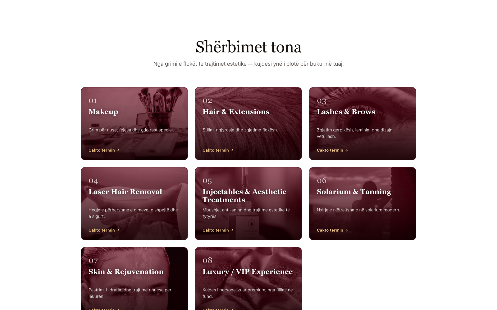
A wine palette built on perceptually uniform color science, a serif display face reserved for headlines only, and duotone-graded photography across every service category — one considered visual language, top to bottom.
- 05
Build
Next.js on Supabase Postgres, with row-level security limiting the public side to a single price-free view, next-intl for the Albanian UI, and a shared-password back office with a timing-safe login.
- 06
Test
The revenue split, daily reconciliation and availability logic are pure, unit-tested functions — and the booking and login paths are rate-limited against abuse before they ever reach production.
- 07
Ship
Deployed to Vercel with the database on Supabase; moving between environments only ever changes environment values, never code.
- 08
Grow
New service categories, prices and split percentages are just data — the salon can extend its own offering without touching a line of code.
What it gets right.
A palette built on color science
The wine brand color is defined in OKLCH, so every hover and focus state is a genuinely consistent step lighter — not a hex value nudged by eye.
Two typefaces, two jobs
A serif display face carries every headline; a humanist sans handles everything else — the two are never mixed, so the hierarchy always reads clearly.
Motion with a mood
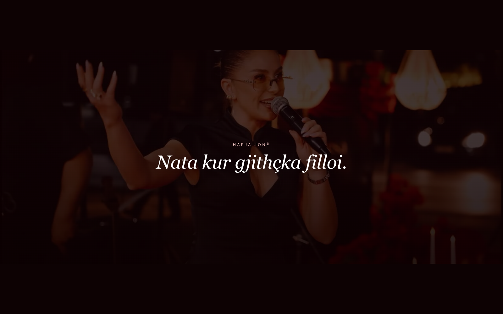
An animated smoke layer drifts behind the hero's hand-lettered mark — restrained motion that sets a tone instead of demanding attention.
Photography with a point of view
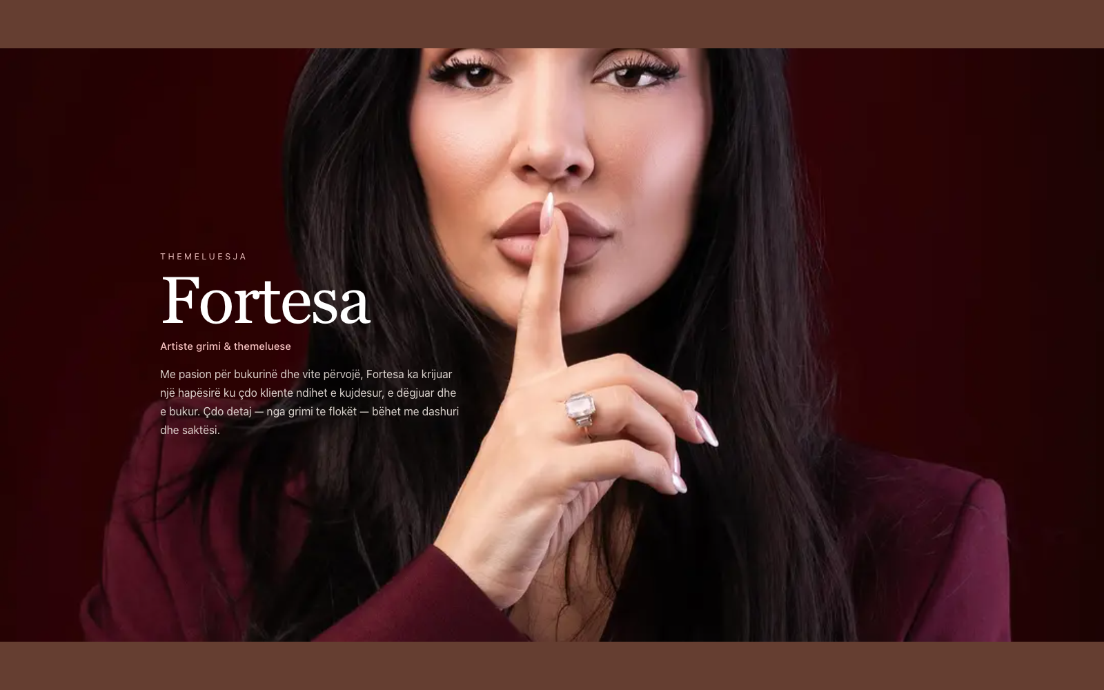
Every service category gets its own duotone-graded photograph in the brand palette, instead of a generic stock-photo grid.
A film, not a slideshow
A muted, looping opening-ceremony video sits behind its own section, with a server-rendered poster frame so nothing ever flashes blank while it loads.
A calm surface, a real back office
Underneath the site sits a secured back office handling revenue splits, daily reconciliation and deposit contracts — the part of the business a visitor never sees, but the salon runs on every day.
Stack
- Next.js (App Router)
- TypeScript
- Supabase Postgres + RLS
- next-intl (sq)
- Tailwind CSS
- Resend
Inside the app.
Representative screens, shown with sample data.
Want a site like this for your business?
We build calm, considered brand experiences and the systems that run quietly underneath them. Tell us what you're building.